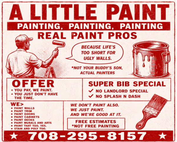
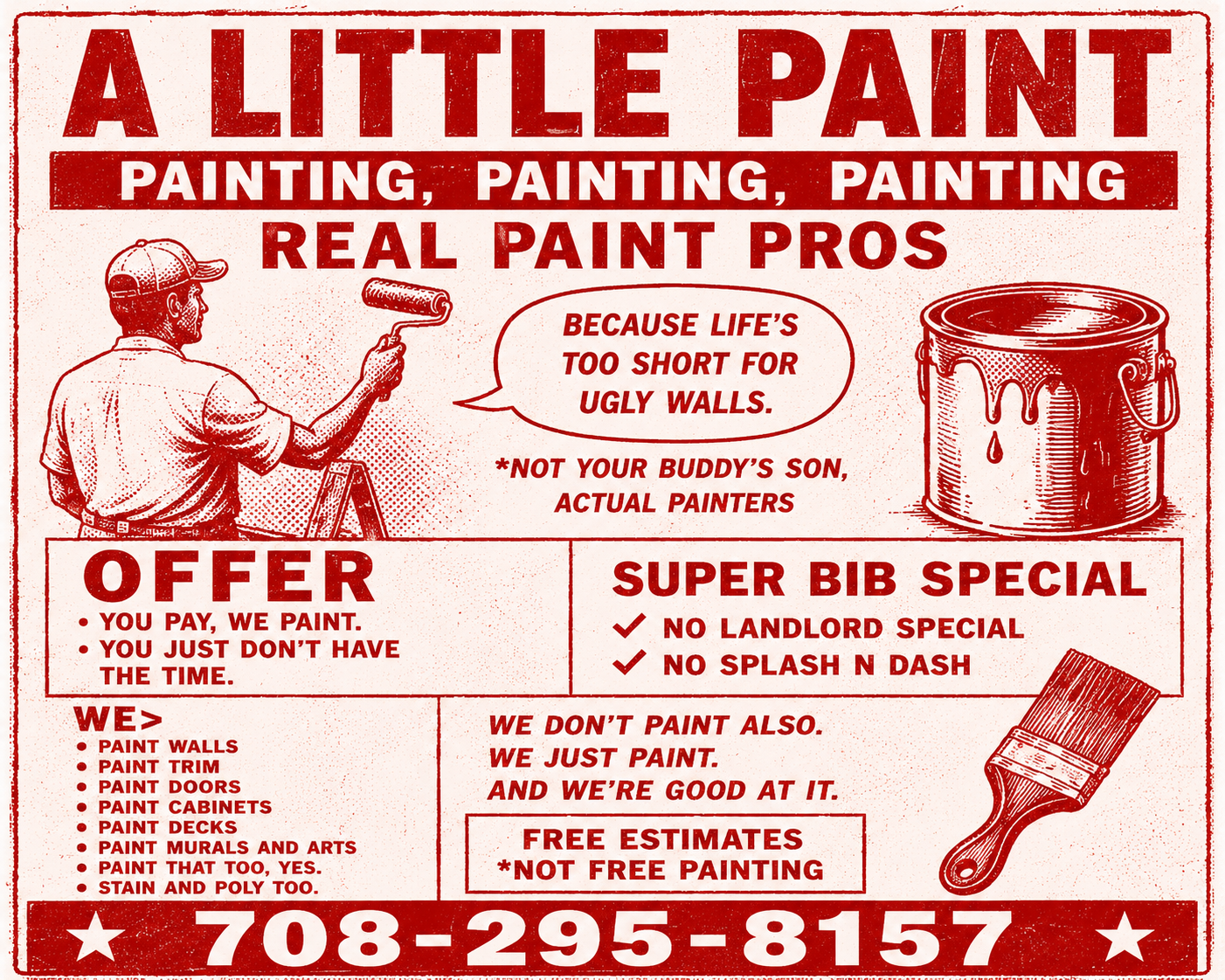
Why I Made a Painting Flyer That Looks Like a Wrestling Poster
Most contractor marketing looks exactly the same.
Blue logo.
Stock photo.
A guy with his arms crossed.
A list of services.
Maybe a flag in the background if they’re feeling adventurous.
There’s nothing wrong with that.
The problem is nobody remembers it.
When I started working on marketing for A Little Paint, I realized I had the same reaction to most painting ads:
I couldn’t tell one company from the next.
So I went in the opposite direction.
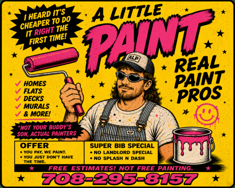
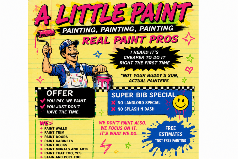
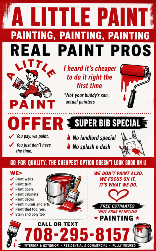
Bright colors.
Cartoon painters.
Ridiculous headlines.
Vintage Chicago contractor vibes.
The goal wasn’t to look professional.
The goal was to be memorable.
Because if a homeowner sees three painting companies this week and remembers one of them a month later, that’s probably the company that gets the phone call.
The funny thing is the inspiration didn’t come from painting companies at all.
It came from comic books.
Old wrestling posters.
Neighborhood handbills.
The kind of advertising that’s impossible to ignore.
Some people probably hate it.
That’s fine.
Nobody remembers safe.
And for a local painting company competing with hundreds of other painting companies, being remembered is a pretty good place to start.